Great Invitations Begin with Great Design
Whether you’re planning a whimsical birthday bash, an elegant wedding, or a casual dinner party, the invitation is the first glimpse your guests will have into your event. It’s more than just a card, it’s your chance to express tone, style, and intention right from the start. That’s why choosing the right font and layout can make all the difference between a forgettable invite and one that earns a place on the fridge.
Why Tools Matter (and Make It Easier Than Ever)
In today’s design-friendly world, you don’t have to be a graphic designer to craft professional-looking invitations. With platforms like your own printable invitation maker, you can explore a wide range of fonts, templates, and layout options that align perfectly with your event’s personality. From romantic scripts to modern sans-serifs, these tools allow you to experiment freely until your invitation feels just right, both visually and emotionally.
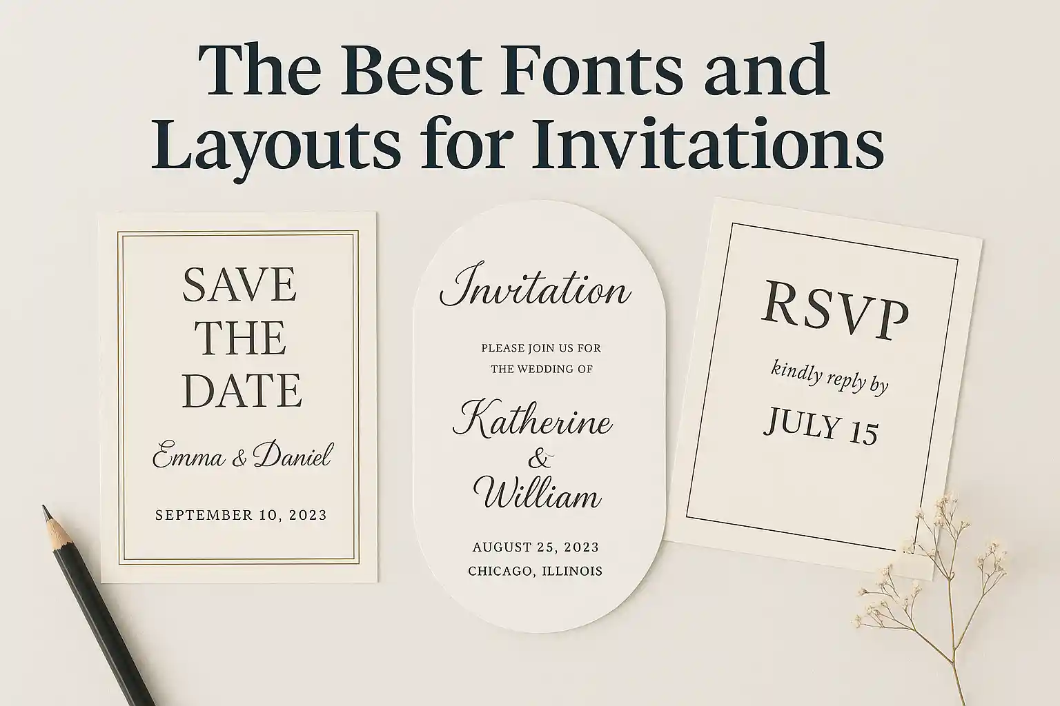
Choosing the Perfect Font
1. Match the Font to the Mood
Fonts tell stories. A calligraphic script whispers elegance, making it perfect for weddings or formal dinners. On the other hand, rounded sans-serif fonts feel casual and friendly, ideal for birthday parties, baby showers, or backyard barbecues.
2. Keep It Readable
While it’s tempting to go for super-stylized fonts, legibility should always come first. Avoid overly ornate styles for body text or key details like the date, time, or location. A clean pairing — such as a decorative header font with a simple body font, keeps things both stylish and practical.
3. Don’t Overdo It
Limit your font choices to two per invitation. This keeps your design clean and cohesive. A good rule of thumb? One for headings, one for body text. Anything more can start to look cluttered or inconsistent.
Layouts That Lead the Eye
A good layout is like a well-planned conversation; it flows naturally. Start with the event title or host name at the top, follow with the date, time, and location, and end with RSVP details or extra notes. White space is your friend: don’t try to squeeze everything into one tight block. Let the content breathe so your invite feels balanced and easy to scan.
Final Thought: Let Your Invite Speak for You
The right combination of fonts and layout doesn’t just deliver information, it sets the stage for the celebration. Take the time to experiment, adjust, and trust your eye. When everything clicks, your invitation won’t just inform, it’ll delight.